Almost there!

A few more tweaks made late last night!

I still have some image line-up issues but my new site is ready to go. It isn’t dramatically different than last years model but its no longer a TABLE! Woot!

OK, its not that big of a deal but it no longer nags me as I lay awake at night…

New version and Old Version.

Next up? The remaining pages, new look and new text!

I did it!*

OK, I committed to do a lot this weekend, clean the garage, create and document my Mom’s blog and change my layout from tables-based to CSS.

I did it all! Woohoo! *Well, I’m still working on my site but it is 95% complete!

OK, little things first. A lot of work, sweat and dirt and I can now park my car in the garage. So I moved all of the stuff from the front of the garage to the back, so what? Parking my car in the garage is sweet!

My Mom’s blog? Done. Documentation? Done. I kinda like it as well! Still couldn’t get the Flash uploader to work, though.

WRP, off tables? Done! Well, almost. I am still working on the site trying to figure out how to do my menu. It is more of a design issue than a CSS issue.

I didn’t go fluid, I went fixed. Maybe that is cheating, I don’t know but I wanted to do something that I understood. So as I stated earlier, I used some guidance from the Opera site. In fact, one site advising how to create a grids and the other about progressive enhancement, was all that I needed!

The grid article was great and I used it to start from scratch. Once I created a grid, I started to think about the grid in respect to the table-based design. It worked great!
I’ve got a problem

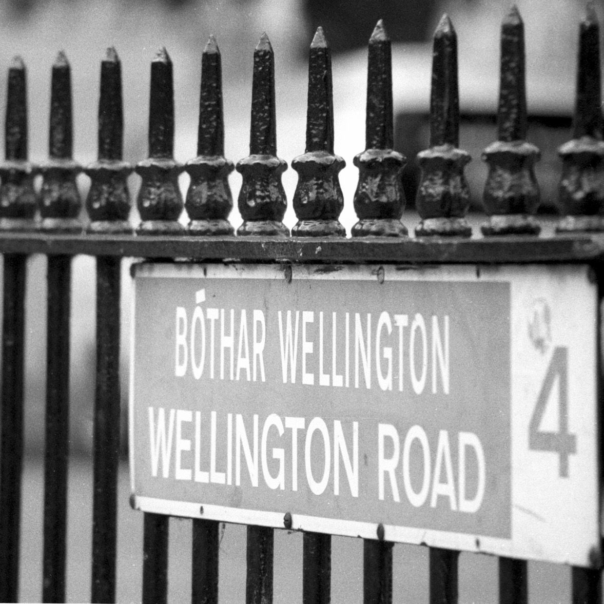
I’ve had it for several years. My Wellington Road Pictures site uses a table for formatting.

I know, I know its wrong, wrong, wrong but hey, it validates!

I’ve tried a couple of times to clean it up but I’m not so much on Web design.

Every six months or so, I’ll find inspiration. Today, while trying to figure out how I’m going to use CSS Animations (I am starting to think its the millennium’s version of Blink), I ran across more inspiration.

A List Apart is always inspiring. As is the Opera Developer’s site. So this weekend, while my wife is at a Gaited Horse Workshop, I’m going to:

1) Clean the garage or atleast make a dent in it.

2) Finish my Mom’s blog for Mother’s Day (I try to be a good son.)

3) Convert my www.wellys.org site from a table-based design to CSS and columns. Maybe even a grid-based, flexible, liquid layout with rounder corners and a AJAX menu.

One can dream, right?

I love it!

So I wanted to add a picture to my header… not a problem. BUT! Now the picture and my blog title were in conflict. Because the header photo was half dark and half light, any title color would look great on one side but not the other. Sigh.

Here’s where it got fun!

Using Safari 4’s Develop menu (enable using the Advanced Tab in Preferences), I used the Web Inspector to see if I could drop the title to just under the photo, oops, move it to the right, and make sure the Search widget lines up at the bottom, change the color, FINIS!

I love it! Update the CSS file with my desired changes and life is but dream!

Well except now I see I have to make just one more tweak…